Vivi. Lotta. Pensa. Biglietto per l'inferno.
Graphic project for the 2015 album of Biglietto per l'inferno album called "Vivi. Lotta. Pensa"
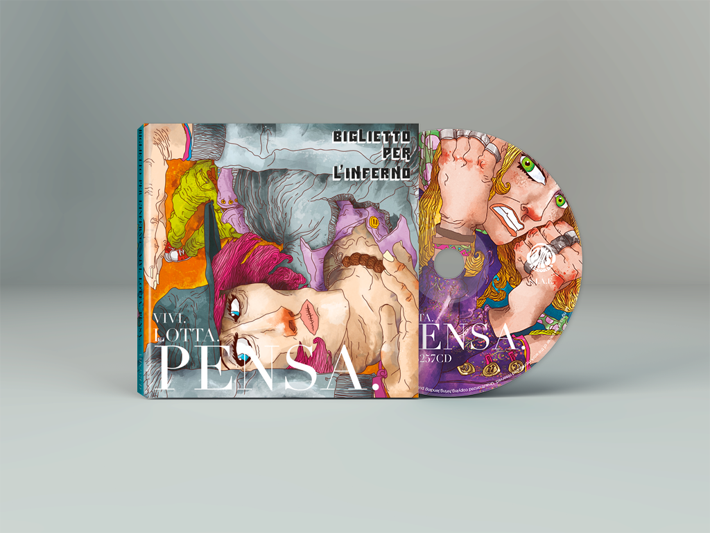
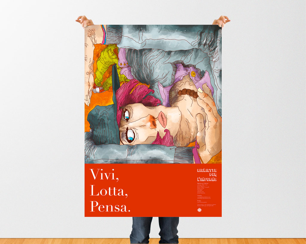
When Biglietto per l'inferno an historical rock progressive band from my hometown asked me to do the design of their upcoming album I were more than surprised. You know it can be really strange when some famous artist asks you to do something that should represent their own image. It's something that has to do with dialogue, but even with your and their innerself. We are talking about the graphic concept of their music. At the beginning I accepted only after meeting them and having some drink together. Just to know who they are. And the touch was fast and incredible. From those meetings came out the idea of the cover. A man/femal who is boxed into the album cover, struggling to get out.
The title " Live, Fight, Think" should have been resumed in one big image. But when I started darwing the thinking man, the first subject, I noticed how he wasn't a fighter and even someone who's inner meaning is to live. That's the reason why I developed the other two characters. The woman as a fighter, and the old man with the newborn as the Life character.
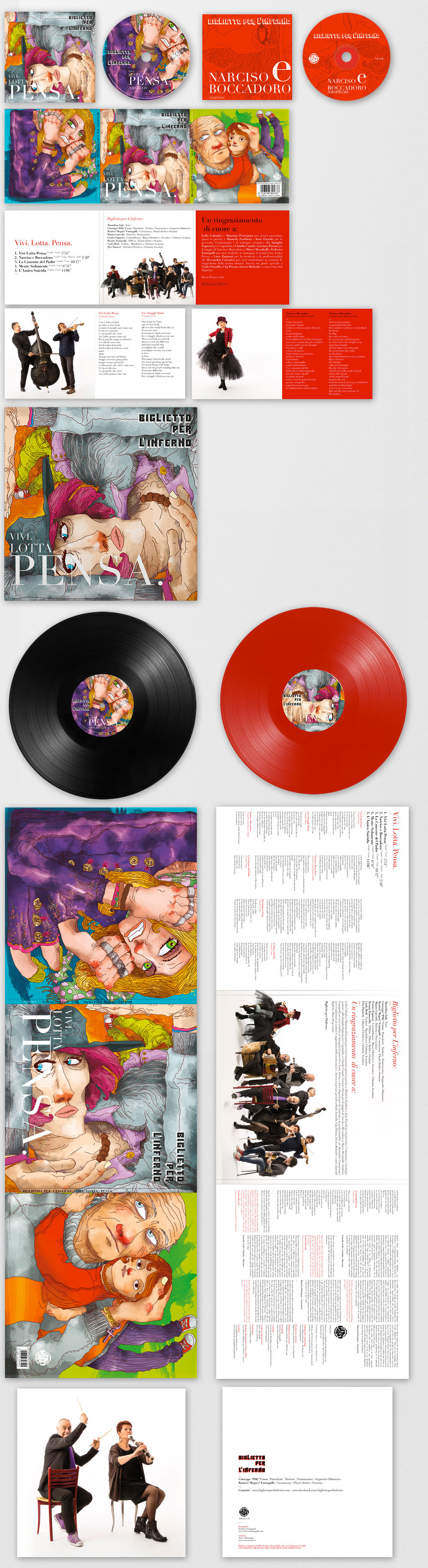
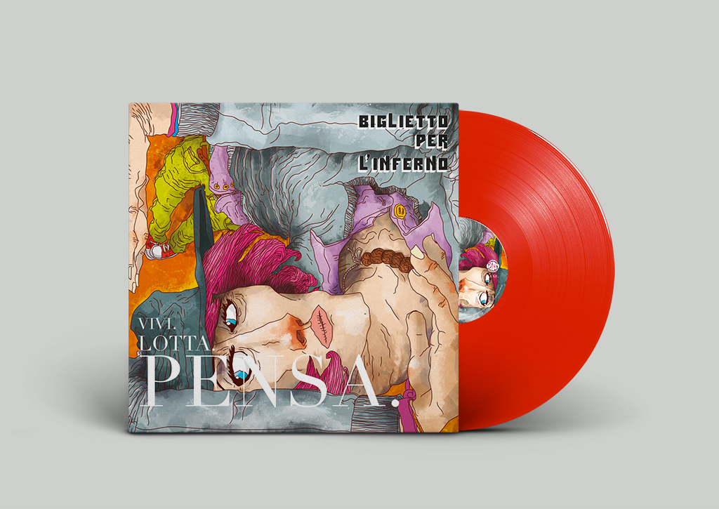
The original idea of the project was to develop a graphic for a cd and for a vinyl album. Things got better and better during the work, while the band became more an dmore involvedi into the graphic project, so the idea of a red vinyl and of a promotional single came out naturally. Last but not least we thought to realize the three limited edition posters in 200 copies as a promotional gadget and to design some vinyl cards with the band pictures of Federica Fumagalli.
Think.
The thinking man is the archetipe of the artist. He has broken the pink handcuffs on his left hand because he devoted himself to the freedom of art and music. He wears the typical hat that the band singer wears during all the BPI concerts. On his neck he has a typical tibetan necklace symbol of freedom and respect for the people and for the thoughts of everyone.
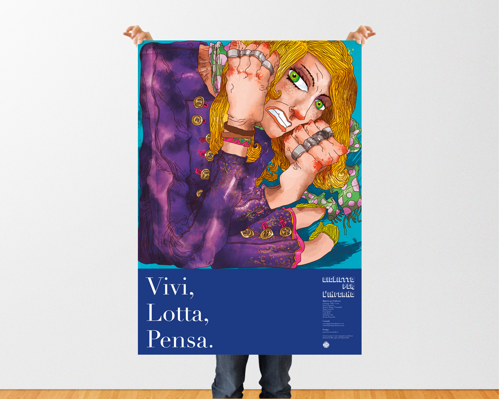
Fight.
Why I choosed a woman as a fighter? It can be obvious but I think that women around the world has still so many battles to win before obtaining at the end the victory of the war of equality. I wanted to draw a struggling woman with rings on her fingers who can be used even as punch brass knuckles. She has her fingers covered in blood because of her fight, but she always looks feminine and gracefull in her struggle for her rights.
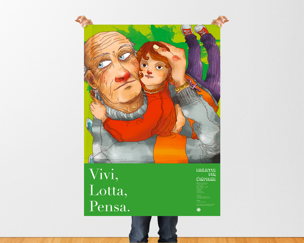
Live.
The old man represent my girlfriend grand father who passed away, as the Orus cross on his bracelet represent, when my six years old son Michelangelo was born. It was some kind of life transmigration. We always said that everytime someone dies a newborn come. My son is in his arm, something that unfortunately was impossible to happen, the boy looks at you because you both are alive, while the old man looks at another place where the dead people go.
The single who was printed out in only 200 copies was done to promote the early selling of the album. The graphics contains the Life character all on a red background, and as the lyric of the song says, there is a particle of the lips on the cd graphics.
The red colour was choosed because of the main theme of the song "Narciso e Boccadoro".
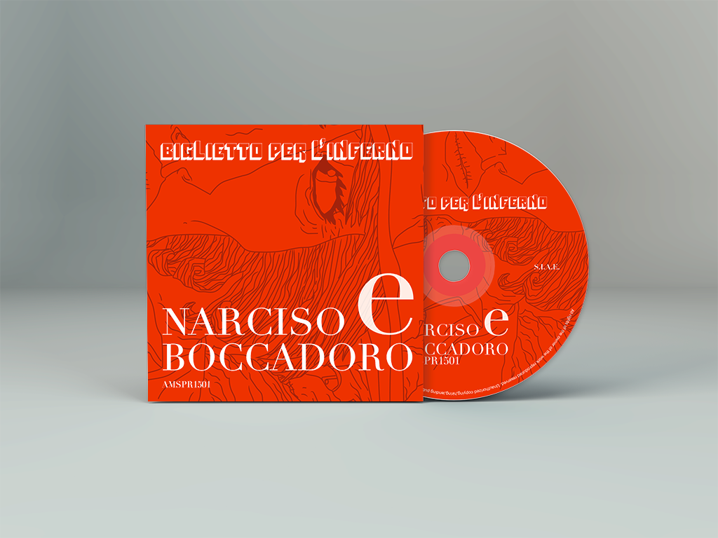
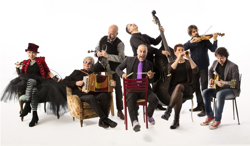
All the photography were made by Federica Fumagalli - www.federicafumagalli.com
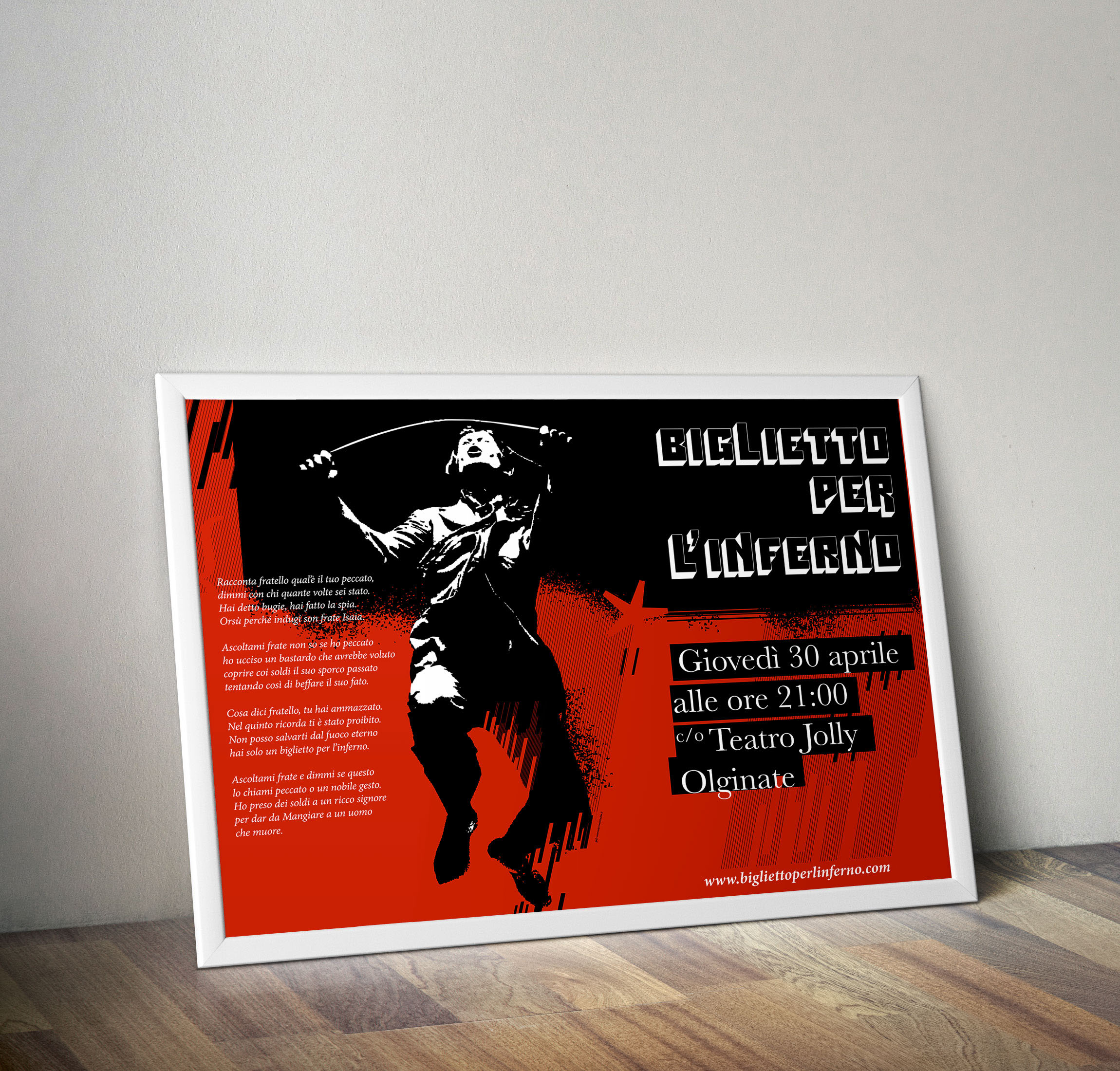
This was the poster I did for the first tour concert in a small town near my hometown. I wanted to give an homage to the old BPI iconic graphic of the singer who is jumping with a whip in his hands. I wanted to do a more modern version of the idea bringing the old image into a 2015 view.